Graphic Design
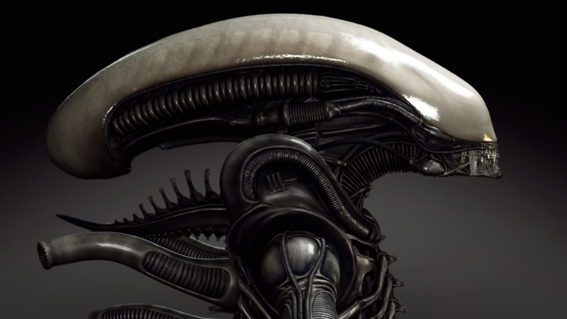
Alien - H. R. Giger's Beautiful Monster - An interesting look at the work of horror's most influential designer: Hans Rudolf “Ruedi” Giger.
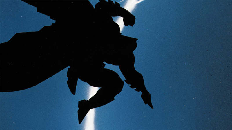
So...why does all the writing in comic books look like that? Vox's Phil Edwards looked into it and found an aesthetic shaped by comics culture, technology, and really...
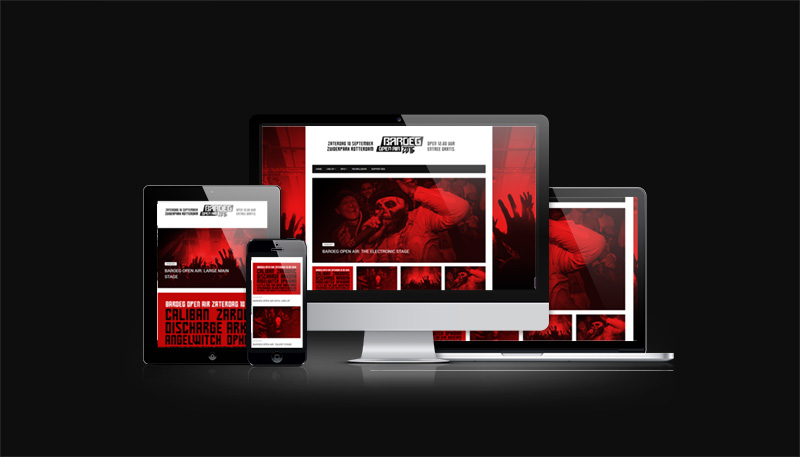
Re-designed and developed the site for Baroeg Open Air an annual festival organised by Baroeg. The festival is characterised by its broad underground line-up and pleasant...
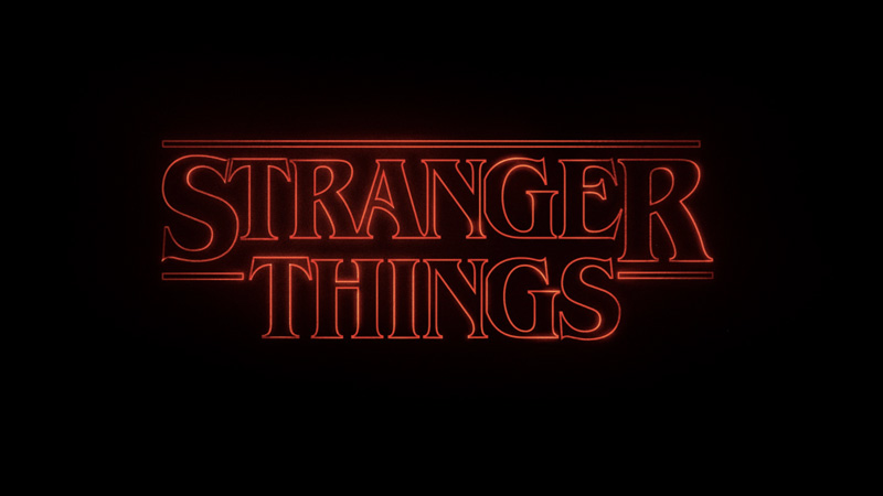
How Stranger Things got its retro title sequence. The Netflix hit went old-school for its opening credits. I love these videos on graphic design and typography.
Designed a logo for a segment called Soul Food from the radio show Dwars door Rijnmond with Marleen Scheurkogel.
Each weekday from 10:00 till 13:00 on Radio Rijnond.
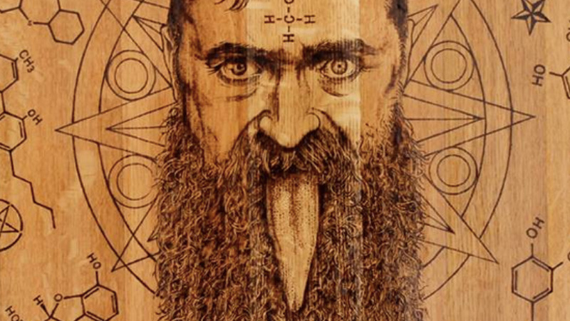
Arno Coenen pyrograveert vanaf 1000 piek inleg je bakkes in de bar, of iets anders naar uw gading, logo kan ook, ik maak er iets fraais van.
Designed a logo for "A Deeper Shade of Soul", a one hour of soul radio from the heart of Rotterdam, presented by Cathelijne Beijn. Every Sunday evening from 22.00 till 23:00...
Established in 1997, Netflix is the best thing to happen to entertainment consumption since the invention of the wireless television remote control. It’s also the world’s...
Grafisch ontwerp voor het Regiehuis een jong dynamisch Video Productie bedrijf in Rotterdam voor bedrijfsfilms, evenementen en congressen en live registraties.
A Brief History of Game Graphics. From naïve origins to the rise of cinematic realism: an account of graphical milestones in video games.
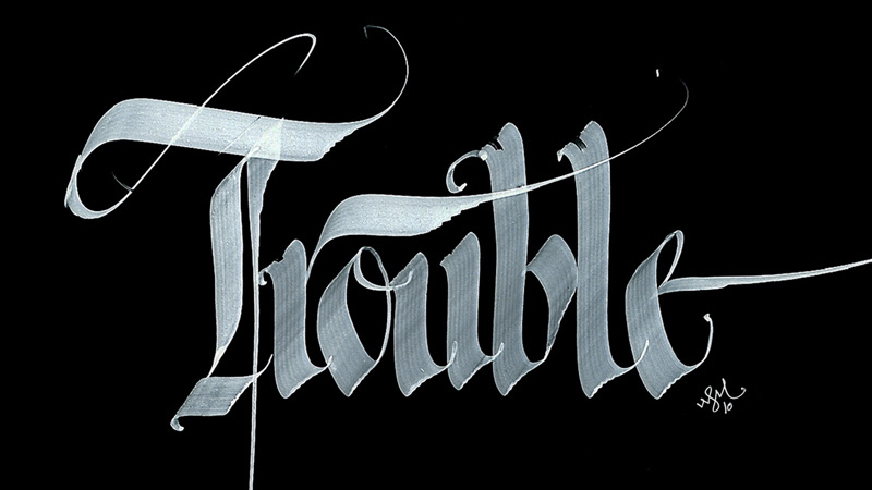
Blackletter, also known as Gothic script, Gothic minuscule, or Textura, was a script used ... Modern interpretation of blackletter script in the form of the font "Old English"...
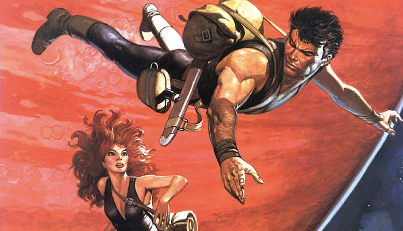
Dick Matena praat over Don Lawrence voor wie hij in 1978-1979 vier Storm boeken schreef. Op scenario van Martin Lodewijk tekende Matena zelf vanaf 1996 drie spin-off verhalen...
